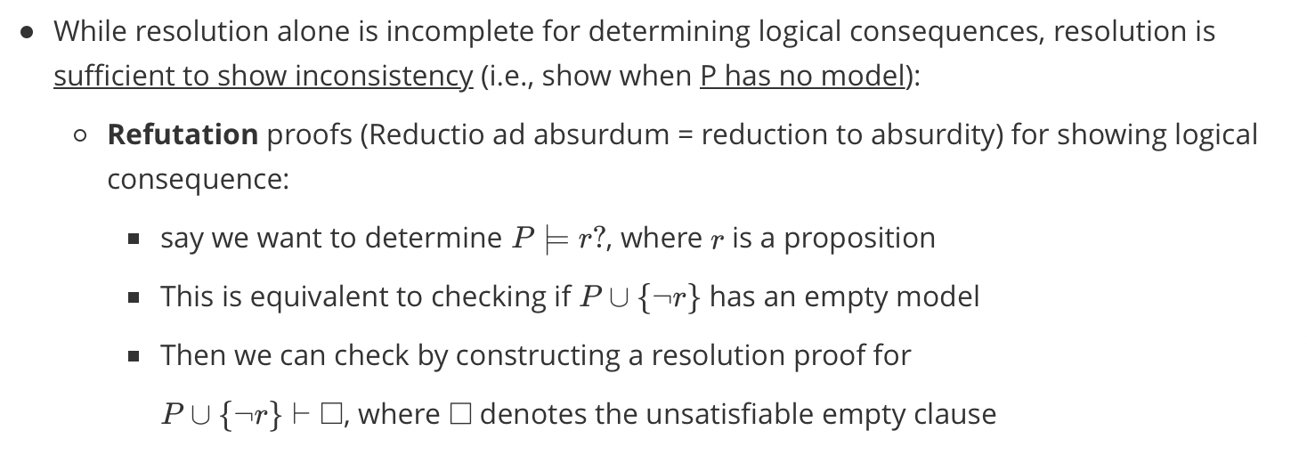
Refutation Proofs
1 | parent(pam, bob). |
Goal G:
For what values of Q is :- anc(tom, Q) a logical consequence of the above program?
Negate the goal G:
i.e. $\neg G \equiv \forall Q \neg anc(tom, Q).$
Consider the clauses in the program $P \cup \neg G$ and apply refutation
Note that a program clause written as
$p(A, B):- q(A, C), r(B, C)$ can be rewritten as
$\forall A, B, C (p(A, B) \or \neg q(A, C) \or \neg r(B, C))$
i.e., l.h.s. literal is positive, while all r.h.s. literal are negative
A substitution $\theta$ is a unifier of two terms s and t if $s\theta$ is identical to $t\theta$
$\theta$ is a unifier of a set of equations ${s_1=t_1, …, s_n=t_n}$, if for all $i, s_i\theta=t_i\theta$
A set of equations E is in solved form if it is of the form
${x_1=t_1,…, x_n=t_n}$ Iff no $x_i$ appears in any $t_j$.
After you train a model. you need to evaluate it on your testing data.
What statistics are most meaningful for:
There are four possible outcomes for a binary classifier:
Identifying the best threshold requires deciding on an appropriate evaluation metric.
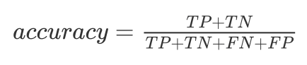
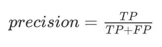
The accuracy is the ratio of correct predictions over total predictions:
The monkey would randomly guess P/N, with accuracy 50%.
Picking the biggest class yields >= 50%.
When |P|<<|N|, accuracy is a silly measure. If only 5% of tests say cancer, are we happy with a 50% accurate monkey?
The monkey would achieve 5% precision, as would a sharp always saying cancer.
In the cancer case, we would tolerate some false positive (scares) to identify real cases:
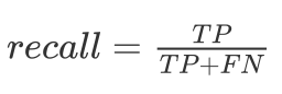
Recall measures being right on positive instances. Saying everyone has cancer gives perfect recall.
To get a meaningful single score balancing precision and recall use F-score:
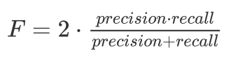
The harmonic mean is always less than/equal to the arithmetic mean, making it tough to get a high F-score.
Varying the threshold changes recall/precision. Area under ROC is a measure of accuracy.
Classification gets harder with more classes.
The confusion matrix shows where the miskates are being made
What periods are most often confused with each other?
The main diagonal is not exactly where the heaviest weight always is.
Too low a classification rate is discouraging and often misleading with multiple classes.
The top-k success rate gives you credit if the right label would have been one of your first k quesses.
It is important to pick k so that real improvements can be recognized.
For numerical values, error is a function of the delta between forecast f and observation o:
These can be aggregated over many tests:
The best way to assess models involve out-of-sample predictions, results on data you never saw (or even better did not exist) when you built the model.
Partitioning the input into training (60%), testing (20%) and evaluation (20%) data works only if you never open evaluation data until the end.
Formal evaluation metrics reduce models to a few summary statistics. But many problems can be hidden by statistics:
Revealing such errors requires understanding the types of errors your model makes.
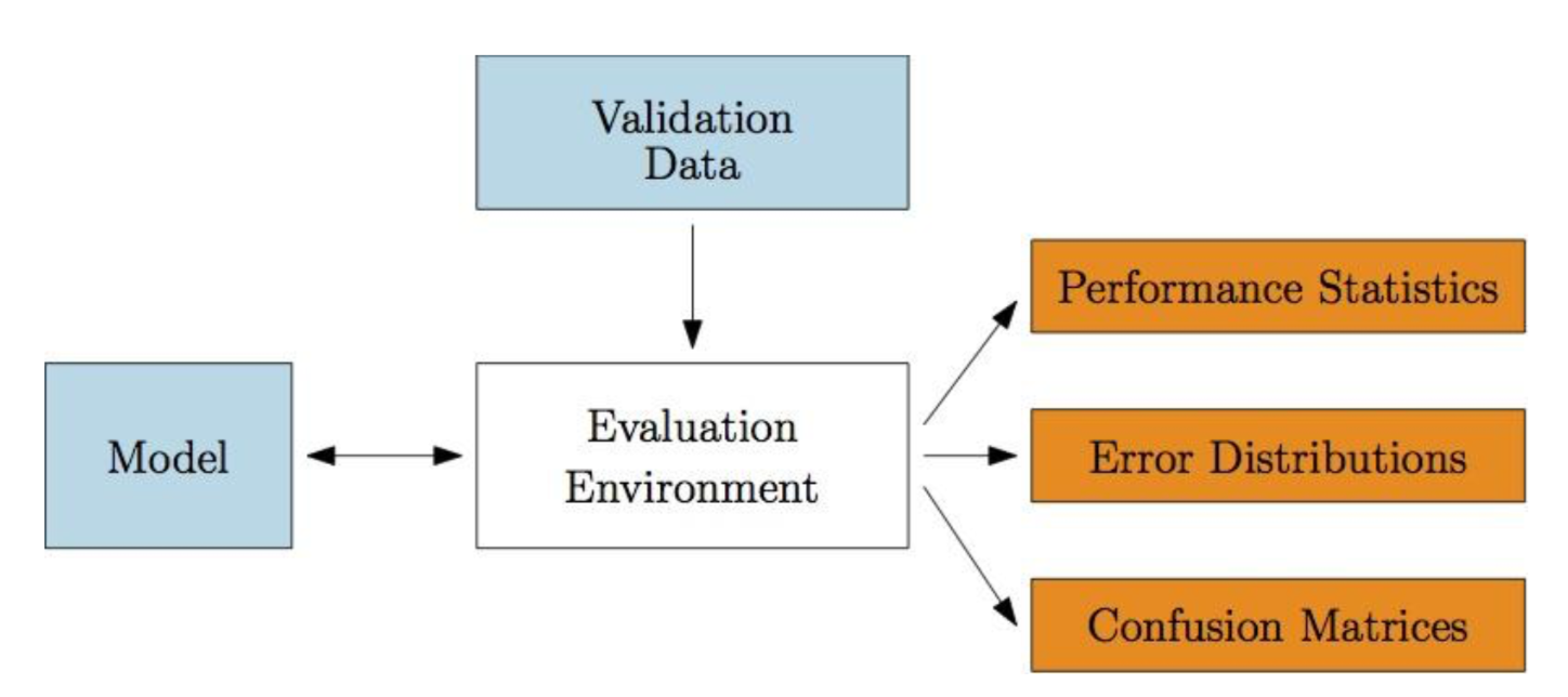
You need a single-command program to run your model on the evaluation data, and produce plots/reports on its effectiveness.
Input: evaluation data with outcome variables
Embedded: function coding current model
Output: summary statistics and distributions of predictions on data vs. outcome variables
A joke is not funny the second time because you already know the punchline.
Good performance on data you trained models on is very suspect, because models can easily be overfit.
Out of sample predictions are the key to being honest, if you have enough data/time for them.
Often we do not have enough data to separate training and evaluation data.
Train on (k - 1)/k th of the data, evaluate on rest, then repeat, and average.
The win here is that you get a variance as to the accuracy of your model!
The limiting case is leave one out validation.
There are several measures of distance between probability distributions.
The KL-Divergence or information gain measures information lost replacing P with Q:
$D_{KL}(P||Q)=\sum_i P(i)ln\frac{P(i)}{Q(i)}$
Entropy is a measure of the information in a distribution.
Ideally models are descriptive, meaning they explain why they are making their decisions.
Linear regression models are descriptive, because one can see which variables are weighed heaviest.
Neural network models are generally opaque.
Lesson: ‘Distinguishing cars from trucks.’
Deep learning models for computer vision are highly-effective, but opaque as to how they make decisions.
They can be badly fooled by images which would never confuse human observers.
Recall:
F is a logical consequence of P
Since there are (in general) infinitely many possible interpretations, how can we check if F is a logical consequence of P?
Solution:
choose one ‘canonical‘ model I such that
Given an alphabet A, the set of all ground terms constructed from the constant and function symbols of A is called the Herbrand Universe of A (denoted by $U_A$).
Consider the program:
1 | p(zero). |
The Herbrand Universe of the program’s alphabet is:
$U_A={zero, s(zero), s(s(sero)),…}$
Consider the ‘relations’ program:
parent(pam, bob).
parent(bob, ann).
parent(tom, bob).
parent(bob, pat).
parent(tom, liz).
parent(pat, jim).
grandparent(X, Y):-
parent(X, Z), parent(Z, Y).
The Herbrand Universe of the program’s alphabet is:
$U_A={pam, bob, tom, liz, ann, pat, jim}$
Given an alphabet A, the set of all ground atomic formulas over A is called the Herbrand Base of A (denoted by $B_A$).
Consider the program:
1 | p(zero). |
The Herbrand Base of the program’s alphabet is:
$B_A={p(zero), p(s(zero)), p(s(s(zero))),…}$
Consider the ‘relations’ program:
parent(pam, bob).
parent(bob, ann).
parent(tom, bob).
parent(bob, pat).
parent(tom, liz).
parent(pat, jim).
grandparent(X, Y):-
parent(X, Z), parent(Z, Y).
The Herbrand Base of the program’s alphabet is:
Looking carefully at your data is important:
Feeding unvisualized datta to a machine learning algorithm is asking for trouble.
A large fraction of the graphs and charts I see are terrible: visualization is harder than it looks.
All four data sets have exactly the same mean variance, correlation, and regression line
=> Plot the Ascombe’s Quartet
Sensible appreciation of art requires developing a particular visual asethetic.
Distinguishing good/bad visualizations requires a design aesthetic, and a vocabulary to talk about data representations:
Data-Ink Ratio = $\frac{\text{Data ink}}{\text{Total ink used in graphic}}$
$\frac{\text{(Size of effect in graphic)}}{\text{Size of effect in data}}$
The fixing a two- or three-dimensional representation by a single parameter yields a lie, because area or volume increase non-proportionally to length.
Graphical Integrity: Scale Distortion
Always start bar graphs at zero.
Always properly label your axes.
Use continuous scales: linear or labelled.
Aspect Ratios and Lie Factors
The steepness of apparent cliffs is a function of aspect ratio. Aim for 45 degree lines or Golden ratio as most interpretable.
Extraneous visual elements distract from the message the data is trying to tell.
In an exciting graphic, the data tells the story, not the chartjunk
Use proper scales and clear labeling
Tables can advantages over plots:
Representation of numerical precision
Understandable multivariate visualization:
each column is a different dimension.
Representation of heterogeneous data
Compactness for small numbers of points
Always Think this - Can this Table be Improved
Scatter plots show the values of each point, and are a great way to present 2D data sets.
Higher dimensional datasets are often best projected to 2D, through self-organizing maps or principle component analysis, although can be represented through bubble plots.
Color points on the basis of frequency
Using color, shape, size, and shading of ‘dots’ enables dot plots to represent additional dimensions.
Bar plots show the frequency of proportion of categorical variables. Pie charts use more space and are harder to read and compare.
Histograms (and CDFs) visualize distributions over continuous variables:
Given a binary tree
1 | struct TreeLinkNode { |
Populate each next pointer to point to its next right node. If there is no next right node, the next pointer should be set to NULL.
Initially, all next pointers are set to NULL.
Note:
Given the following binary tree,
1 | 1 |
After calling your function, the tree should look like:
1 | 1 -> NULL |