What is a Heatmap?
A heat map (or heatmap) is a graphical representation of data where the individual values contained in a matrix are represented as colors.
Heap maps originated in 2D displays of the values in a data matrix.
- Larger values were represented by small dark gray or black squares
- Smaller values were represented by small lighter squares
Different Kinds of Heatmaps:
- Web heatmaps have been used for displaying area of a Web page most frequently scanned by visitors. There are severall different types of heatmaps, including:
- Scroll maps
- Hover mapping
- Click mapping
- Attention mapping
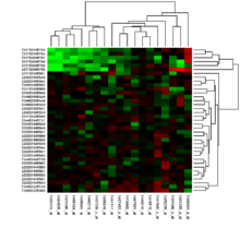
- Biology heatmaps are typically used in molecular biology to represent the level of expression of many genes across a number of comparable samples as they are obtained from DNA microarrays.
- The treemap is a 2D hierarchical partitioning of data that visually resembles a heatmap.
- A density function visualization is a heatmap for representing the density of dots in a map. It enables one to perceive density of points independently of the zoom factor.
When to Use a Heatmap
Heatmaps are perfect for representing data where a defined boundary is relevant to the data.
Here are a few scenarios where having heatmap data handy can help you quickly make better decisions:
- Website reedesign
- A/B testing
- Content marketing
- …
The Reasons Why We Have to Use It
Heatmap data can help you to quickly see:
- Which headlines draw visitors in and make them click
- Which images attract attention and what people do about it – you’ll be surprised how many try to click the image
- What distracts visitors from your core content (Many first-time heat map users are shocked at how differently their users navigate the site compared with their expectations.)
- Whether visitors see your email opt-in box (Low opt-ins and click-throughs can be due to something as simple as opt-in boxes that don’t stand out. Heatmaps make that clear and obvious so you can fix it.)
You can also use a heat map to find out:
- Whether your navigation is working (Do users know it’s there?)
- If people can locate search options easily
- Whether visitors are reading your content and how much of it (This is a huge use case for scroll maps!)
How to Plot a Heatmap?
Plot a Heatmap via Seaborn
Seaborn.heatmap(data, vmin=None, vmax=None, cmap=None, center=None, robust=False, annot=None, fmt=’.2g’, annot_kws=None, linewidths=0, linecolor=’white’, cbar=True, cbar_kws=None, cbar_ax=None, square=False, xticklabels=’auto’, yticklabels=’auto’, mask=None, ax=None, *\kwargs*)
Sorted by importance
data: rectangular dataset
If a Pandas DataFrame is provided, the index/column information will be used to label the columns and rows
vmin, vmax: floats, optional
Values to anchor the colormap, otherwise they are inferred from the data and other keyword arguments.
linewidths : float, optional
Width of the lines that will divide each cell.
linecolor : color, optional
Color of the lines that will divide each cell.
square : boolean, optional
If True, set the Axes aspect to “equal” so each cell will be square-shaped.
xticklabels, yticklabels : “auto”, bool, list-like, or int, optional
If True, plot the column names of the dataframe. If False, don’t plot the column names. If list-like, plot these alternate labels as the xticklabels. If an integer, use the column names but plot only every n label. If “auto”, try to densely plot non-overlapping labels.
cmap : matplotlib colormap name or object, or list of colors, optional
The mapping from data values to color space. If not provided, the default will depend on whether
centeris set.
robust : bool, optional
If True and
vminorvmaxare absent, the colormap range is computed with robust quantiles instead of the extreme values.annot : bool or rectangular dataset, optional
If True, write the data value in each cell. If an array-like with the same shape as
data, then use this to annotate the heatmap instead of the raw data.fmt : string, optional
String formatting code to use when adding annotations.
annot_kws : dict of key, value mappings, optional
Keyword arguments for
ax.textwhenannotis True.cbar : boolean, optional
Whether to draw a colorbar.
cbar_kws : dict of key, value mappings, optional
Keyword arguments for fig.colorbar.
cbar_ax : matplotlib Axes, optional
Axes in which to draw the colorbar, otherwise take space from the main Axes.
mask : boolean array or DataFrame, optional
If passed, data will not be shown in cells where
maskis True. Cells with missing values are automatically masked.ax : matplotlib Axes, optional
Axes in which to draw the plot, otherwise use the currently-active Axes.
kwargs : other keyword arguments
All other keyword arguments are passed to
ax.pcolormesh.
Tips for Designing a Heatmap
Use a simple map outline
These lines are meant to frame the data, not distract.
Select colors appropriately
Use a single color with varying shade or a spectrum between two analogous colors to show intensity.
An important consideration here is selecting colors and contrasts visible to individuals with color blindness.
- Remember to intuitively code color intensity according to values
Use patterns sparingly
A pattern overlay that indicates a second variable is acceptable, but using multiple is overwhelming and distracting.
Choose appropriate data ranges
Select 3-5 numerical ranges that enable fairly even distribution of data between them. Use +/- signs to extend high and low ranges.